The most common way to enhance your design is by hiding or eliminating redundant information. You should always ask yourself:
Is this information really needed in the design?
If not, try to cut it down.
In UX design, this principle has a catchy name — progressive disclosure. It’s about showing only what’s necessary upfront, and revealing more details when needed. Components like dropdowns, accordions, tabs.
Expandable cards are all examples of progressive disclosure in action. They share many similarities with accordions, but with a more flexible, card-based structure that fits certain layouts better.
What is a card? Expandable card vs accordion
Let’s address the elephant in the room. We use card a lot in user interface, we see them everyday. But, what is a card? Like many other design elements, there is no clear definition of it. Each design system has a different way to use and to define things.
But if we boil it down, it is simply:
A card is a UI container that visually groups related information into a compact, scannable block.
The idea comes from real life—business cards, credit cards. These objects organize information into neat pieces you can quickly read and compare. Digital cards do the same thing on screen.

So what makes a card different from an accordion or other expandable components? A card must:
- It must group different types of information into a bite-sized container.
- It must also resemble a physical card, meaning it should have a visually distinct border, such as a line, color, or shadow.
In fact, an accordion can be designed as a stack of cards—but the concept of a card always starts with how it looks, not how it acts.
The Anatomy of an Expandable Card
1. Visual divider
After all, what truly defines a card is its visual divider. Whether it’s a border, a background, or a shadow, a card needs that boundary to be recognized as a card.
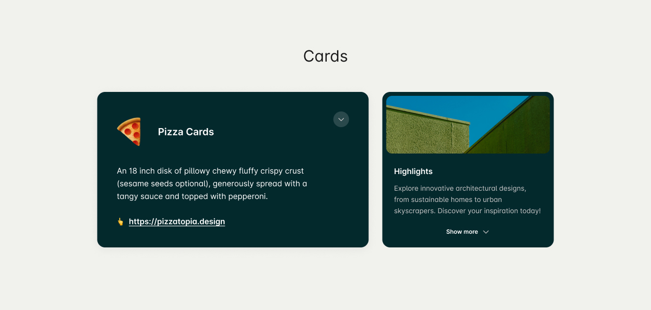


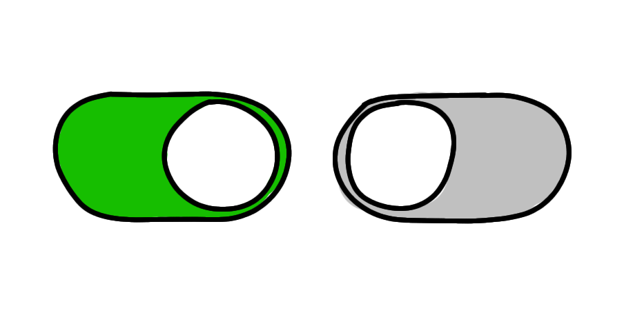
2. Trigger Indicator
An expandable card without a trigger indicator feels like a regular card. Users won’t expect it to expand, which can catch them by surprise and lead to confusion.
As an old saying goes:
Good UX is predictable.

We need some gestures, unmistakable, to tell users that there is something more here. We have arrow icons, plus/minus signs, and finally: caret icons.

Recommendation: A caret is the most reliable choice. While a plus icon is popular, it may be confused with an “add” function. An arrow, on the other hand, can be mistaken for a “jump to” or “open” action.
In some cases, when the revealed information is not secondary and is simply an extension of the original content—like a list or text—you should use a “More” label instead.
3. Summary Information

This is the part users see first, so it must give them the key details they need at a glance.
The summary should be scannable and self-explanatory, allowing users to understand the context without expanding the card. Most users won’t expand the card, so the summary needs to include the essential information they rely on most.
But what counts as “essential”?
Only your users can tell you. Talk to them. Observe them. See whether they frequently expand the card or rarely touch it. Their behavior will show you exactly what needs to live in the summary and what can safely remain hidden.
A tip for designing summary information: you should have a hook—such as an icon, image, or short title—helps anchor their attention and quickly communicate what the card is about.
4. Additional Information (Expanded Content)
Reveals related or secondary details connected to the main summary.
Keep it short and relevant. If the expanded content is too long, you should consider using other type of progressive disclosure like popup or guide users to another page.
Layout
There are two common ways for design expandable cards to behave: overlay expansion and inline (non-overlay) expansion.
An inline expandable card grows in place, pushing the surrounding layout downward as more content appears. This approach is more common for it’s easier for responsive design.
An overlay expandable card, on the other hand, reveals additional content on top of the original card while keeping its footprint fixed. This prevents the layout from shifting, which is useful in dense grids or dashboard views where expanding one card would disrupt the entire structure.
When You Should Use an Expandable Card
When users need only a few pieces of information on the page, they will likely skip most of the content. Hiding most of the content on the page helps users spend their time more efficiently by focusing on the few topics that matter.
1. Most users don’t want or don’t need the content
Use it when most users only need the summary, and only some need the full details.
Good examples:
- A product card that expands to show technical specs
- A task card that expands to show subtasks or notes
- A profile card that expands to show contact methods
2. When you want to keep the user on the same page
If switching to a detail page breaks flow, expanding the card can preserve context.
Examples:
- Reviewing multiple small profiles
- Comparing metrics across several items
- Browsing items where depth is shallow
Inline access helps the user evaluate multiple items quickly.
When Not to Use Expandable Cards
Expandable cards can easily break your UI if used carelessly.
They take up space when expanded and can disrupt scrolling or layout consistency.
Avoid using them when:
- Most users will expand every card anyway (use a list or table instead).
- The expanded content is large, complex (you need to make interaction with the expanded content).
- The layout depends on consistent card sizes (e.g., gallery or dashboard).
Alternatives:
- Accordion (for structured content lists).
- Modal or drawer (for more complex interactions).
- Tooltip or hover card (for lightweight context).
Conclusion
Expandable cards are a useful way to keep your interface clean while still offering more details when needed. They work well when most users only need a quick summary and only a few need the full information. But they also require careful design—because expanding a card can affect layout, content flow, and how users move through the page.
Use expandable cards when they help users focus and stay on the same page. Avoid them when the hidden content is too long, too complex, or when every card will be expanded anyway.
In the end, good design is about showing the right amount of information at the right time. Expandable cards are just one option—choose them only when they truly make the experience simpler, not more complicated.