Skip to content
Android
,
IOS
,
Mobile Application
Waking Up – Conventional meditation app
Typography
Spacings & Text sizes
Related Posts
Waking Up – Conventional meditation app
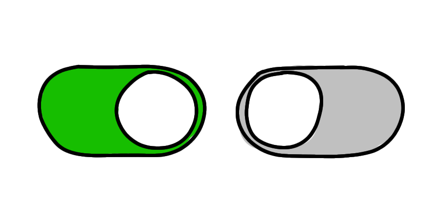
UI toggle ambiguity: toggle switch and toggle icon
There are many ways to describe what a UX designer does, but to keep it simple: our job is to make things easy and enjoyable for
Your guide for ensuring the best readability
Reading is akin to muscle memory; it is one of the most fundamental skills we have developed. However, we often take good typography for granted. Typography
Color’s effect on readability and vision fatigue
Colors are important as many of you may know. They play a significant role in the accessibility, user retention, and design conversion of a project.
How to design UI for multiple buttons
Despite their small size, buttons hold significant importance as a UI element. Their history can be traced back to the early development of machinery and devices.
Is WCAG 2 flawed? A better way to determine text contrast for readability
The Web Content Accessibility Guidelines (WCAG) for readability, has always been a good way to ensure content on digital products is accessible. However, if you go