Table of Contents
Working as a UI/UX designer means encountering tabular tables sooner or later. Especially when you design products that deal with large amounts of information, for someone unfamiliar with table design, it can quickly turn into a nightmare!
Tables are powerful tools to deal with complex data and gain clarity. Frankly, there are only a few times when table alternatives make sense.
However, there are some cases where you can consider alternatives, such as creating a more visual interface or presenting data in a more informative way.
I will discuss alternatives to tables, when and how to use them.
What to consider?
When choosing alternatives to traditional tables, there are several factors to consider. But, at the end of the day, you should always consider users’ intent. The goal is to choose an alternative UI element that aligns with their needs. Here’s what to take notice of:
Data Complexity: If users need precise numerical values, a table or a structured grid may still be the best choice. Complex data may be harder to represent effectively using alternative UI elements.
Data Relationships: Consider the relationships within your data. If you need to show correlations, trends, or comparisons, visualizations like charts or graphs can provide a more intuitive understanding of the information.
Visual Appeal and Engagement: Alternative UI elements can add visual interest and enhance the overall user experience if done appropriately.
Accessibility and Responsiveness: Tables may have some trouble with responsiveness. In some cases, using UI alternatives can be a better choice.
After considering all the aspects, here are some alternatives that you can choose:
1. Chart
You should prioritize using charts over tables when you need to:
- Uncover trends and patterns in data.
- Demonstrate relationships and correlations between different data sets.
- Offer a visually intuitive comparison of values.
- Showcase data variability and distribution.
- Draw attention to key data points.
- Simplify large amounts of information.
On the other hand, tables are best suited for displaying and comparing precise values. You should prioritize using tables over tabs when you need to:
- Locate specific values.
- Display a large amount of diverse data points simultaneously.
Let’s say you’re analyzing the monthly sales performance of different products in your e-commerce store. Instead of presenting the raw sales figures in a table, you can use a bar chart to visually showcase the sales performance. The chart would have the products listed on the x-axis and the corresponding sales values displayed on the y-axis.
This visual representation allows stakeholders to quickly identify the top-selling products, compare their sales figures, and spot any notable variations or trends. The chart provides a clear and concise overview of the sales data, making it easier for decision-makers to understand and act upon the information.
2. Card
Another element that you can use to replace tables is cards.
When considering whether to use a table or a card layout, it’s important to understand the differences and the context in which each is most suitable.
Tables are best used when presenting structured and tabular data in a clear and organized manner. They are ideal for displaying data in distinct columns and rows, making it easy to compare values and perform calculations. Tables are commonly used for data analysis, financial reports, and displaying large amounts of information.
On the other hand, card layouts are more suitable for presenting individual pieces of information or content in a visually appealing and compact format. They are often used in user interfaces to showcase specific elements such as products, articles, or user profiles. Cards can include images, titles, descriptions, and interactive elements, providing a more engaging and visually driven experience.
The choice between a table and a card layout depends on the nature of the content and the user’s interaction needs. If you have structured data that requires easy comparison and analysis, a table is likely the better choice. However, if you’re presenting individual pieces of information in a visually appealing and interactive manner, a card layout can be more effective.
When deciding between cards and tables, it’s important to consider the ease of comparison, readability, scrolling, image display, and clutter factor:
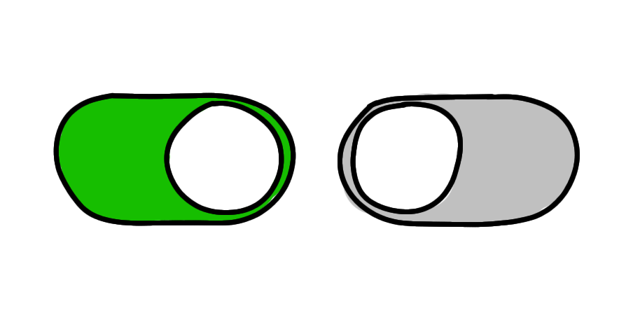
In some cases, you can provide users the option to toggle between viewing data as cards or as tables.
In a tabular format, the comparison is straightforward as it allows for vertical scanning, making it easy to find the lowest price or compare values. However, when dealing with mixed data, such as different types of content or columns, comparison becomes more challenging in the card format.
Long blocks of text are difficult to read in a table, increasing the row width and making it less readable. In contrast, the card format enables a more readable text display, improving the overall reading experience.
Displaying images in a tabular format can be problematic, often requiring small thumbnails. This limitation can impact e-commerce sites, as small images may reduce sales. In contrast, the card format doesn’t have this constraint, allowing for larger and more visually appealing images.
In the card format, labels are repeated for each row, which can create more clutter compared to the table format.
Example: The pricing section can be displayed either by cards or by tables. When you use cards, you can emphasize more on individual plans. When using tables, you make it easy to scan and compare between options.
Conclusion
Tables can be a powerful tool for handling complex data, but there are situations where alternative UI elements may be more visually appealing and effective.
Charts are great for uncovering trends, showing relationships, and simplifying information.
Cards offer a visually appealing and compact format for presenting individual pieces of information. Consider factors like data complexity, user context, and visual appeal when choosing between tables, charts, or cards. Providing the option to toggle between cards and tables can offer flexibility to users.


