I’ve noticed that many designers rely solely on intuition when it comes to spacing, and it’s not surprising. Correct spacing may appear simple, but it’s a skill that requires practice to master.
Moreover, every product has its unique spacing system, and no rigid rules govern spacing. Instead, there are still best practices to follow.
That’s when the 4 or 8-point grid systems come into play. They bring clarity and simplicity by limiting your options and making your life easier. However, even with these systems, the rules can still be vague. You have to decide which spacing option works best for your design, be it 8, 12, or 16 points.
Maintaining design consistency can still be a challenge. In this article, I’ll introduce you to the 8-point grid system and show you how to better apply it dynamically in your designs.
The 8-point grid system
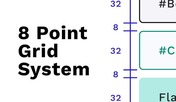
The 8-point grid system is a precise and flexible method UX designers use to establish consistent spacing and alignment between elements. It involves dividing the layout into a grid, with each unit of measurement equal to 8 pixels or points. By adhering to this grid, designers can maintain a sense of balance throughout their designs.
The beauty of the 8-point grid lies in its versatility. Designers can easily create spacing increments by multiplying or dividing 8, such as 8, 16, 24, 32, etc. This system provides a reliable framework for spacing elements, ensuring consistency and visual cohesion across different screen sizes and devices.
By using the 8-point grid system, designers can achieve several benefits. Firstly, it simplifies the design process by providing a clear way to establish spacing relationships between elements. Secondly, it enhances the overall visual appeal of the interface by making it consistent. Lastly, developers will love you for it. Developers usually use rem unit, which is equal to the base font size – 16px. By using the 8-point grid system, you can make your and their lives much simpler.
It is worth noting that while the 8-point grid system is widely embraced, some designers have also started exploring alternative approaches, such as the 4-point grid system. This system allows for even finer spacing increments, offering greater flexibility and precision in design layouts.
However, it’s important to remember that the primary goal of implementing an 8-point grid system is to minimize choices, promote consistency, and enable more intentional decision-making. Unless you’re dealing with a complex design that involves numerous small components, I recommend sticking with the 8-point system.
Spacing friendship
If you are in the design business, whether graphic or digital painting,… you must have heard about the principle of proximity.

This principle suggests that when elements are positioned close together, we perceive them as belonging to the same group. Conversely, we categorize elements into separate and distinct groups when they’re far apart.
The closeness between elements implies a certain level of “Friendship”. This concept, referred to as “Spacing Friendship” by the UX collective, allows us to categorize spacing based on the perceived relationship between elements.
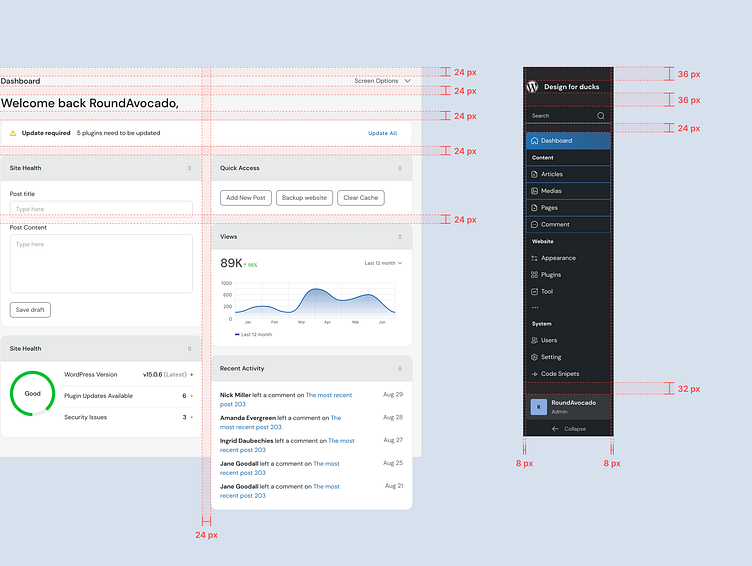
Let’s take this card design as an example. Initially, everything is aligned at 16 pixels, and it doesn’t look too shabby, does it?

With the right spacing technique, we can take it to a whole new level. By grouping related content, we establish a natural visual hierarchy and divide the design into trunks for better scanning.

I allocated 8px spacing to closely related elements such as the heading and description.
The card, such as the image, tags, information, and button, provide additional information or enable actions related to the cards. So they still related to each other, I put their “friendship” level as “Friends” and assigned a spacing of 16px.
Lastly, to visually group all the content within the card together, I applied a larger padding of 24px.
Spacing is relative
You can understand spacing better if you look at the bigger picture. There’s a reason why 8-point spacing is so popular: it’s based on the most fundamental elements: the texts.
The spacing may need to be adjusted when you’re using a font size other than 16 pixels.
Our spacing system is usually designed around a 16px font size in most cases. The website hero section, for example, needs a little bit of spacing adjustment because everything is bigger.
The spacing system needs to be adjusted if you want the design to have more breathing room or if your smallest font is bigger than 16px.
For example: When the hero section has the smallest font of 32 pixels (texts in the cards are not taken into account):

In this case, the “best friends spacing” is half of 32px, which is 16px. The “Casual friend spacing” is 48px.
Solution for dynamic spacing
For dynamic spacing, the spacing should be built around a constant, which I call x or in some design systems like Atlassian calls “base unit”:
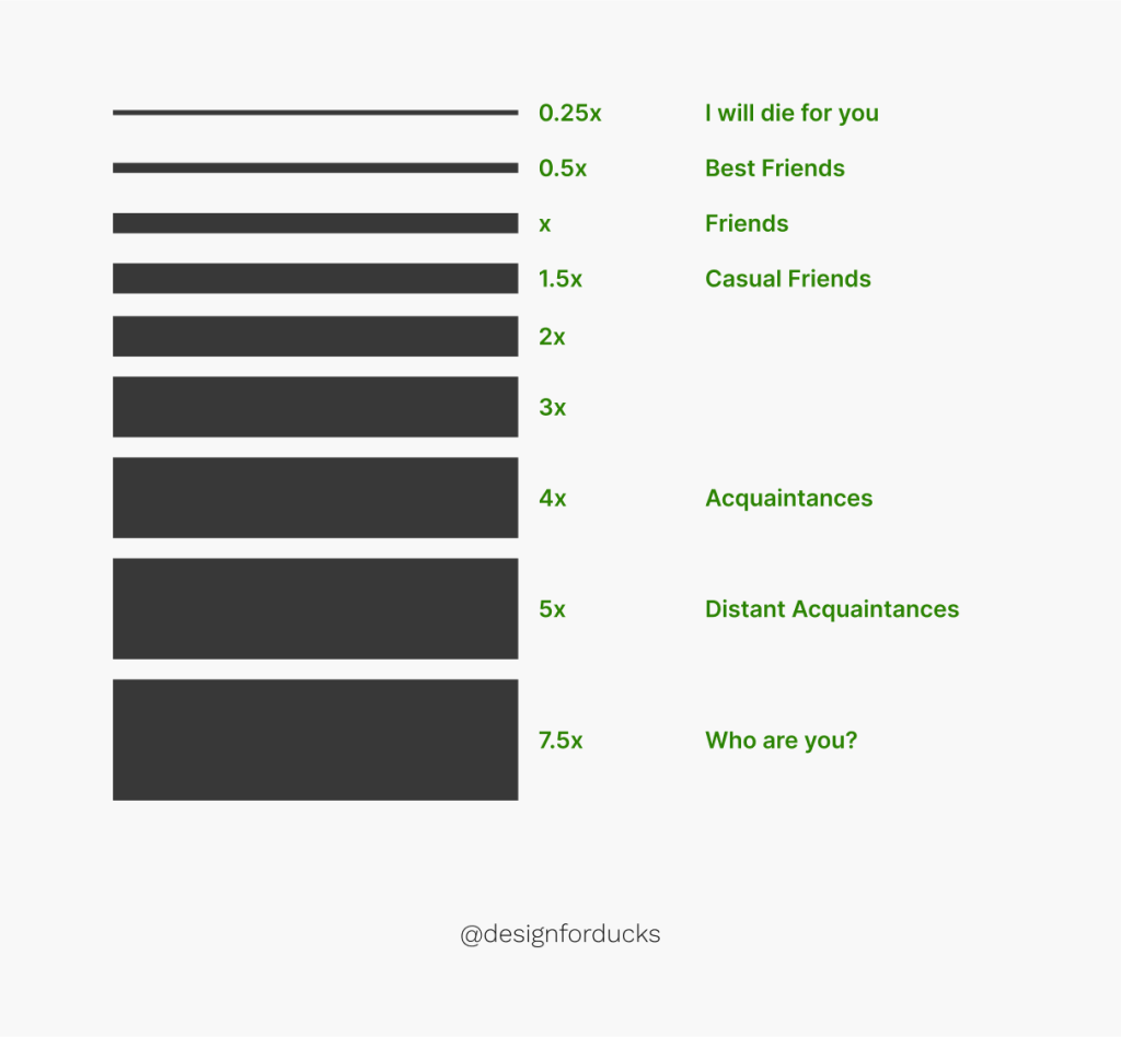
You can make X 0.75 – 1.25 times the size of your smallest element (usually the text). In most cases, you should use a ratio of 1. Sometimes, when you want the design to have more breathing room, like in the hero section, you can use a 1.25 ratio.
When you want the design to be more compact to save space, you can use a 0.75 ratio.

In Storybook’s header section, the smallest font size is 16px. To create more breathing room, the design uses x equals 1.25 times 16px, which is 20px.
Back to the card example: whether you want the design to feel compact or spacy, you can change the x constant accordingly:

There are no correct answers, as long as you are consistent with your design and users have no problem comprehending the content.
Try to be consistent
Like I said before, there are no correct answers. But you still need to be consistent and try your best to limit your spacing options.

That’s why I recommend sticking with the 8-pixel grid system instead of a smaller system like the 4-pixel grid system. Believe me, in the future, you will thank me so much for that.
A simple design project can get super messy as time passes. Spending a few hours on a guide and limiting your choice can save you countless days trying to fix or toggle between options after.
For “Casual Friends” spacing, you can use 1.5x or 2x and try to use only one ratio. For some special cases, when you want to have more space, you can adjust the spacing a little, like in the hero section where you want to have more space.
Conclusion
In a nutshell, by using the 8-point grid system, and considering spacing friendships, designers can create balanced designs.
Not to forget, incorporating the x constant for spacing lets you achieve dynamic spacing that adapts to the smallest element’s size. By doing so, you can have more control in spacing the design while still keeping it cohesive and consistent.