Table of Contents
Checkboxes are a common element that allows multiple selections. It has remained unchanged for a long long time and people have gotten used to it. But sometimes, there are some situations where there are problems when using the humble checkboxes, or in some situations, there are better choices.
As technologies change, it’s worth exploring newer options. In this article, I will introduce checkbox alternatives and what pitfalls to look out for when designing them.
Check token – A visual alternative to checkboxes

One alternative I’ve been using instead of checkboxes is check tokens. They are good choices when you have only limited options to choose from.
They work like checkboxes at their core by letting users pick multiple choices. But instead of those classic square boxes, tokens comprise more supportive elements like visual cues, and support texts,..
This change can enhance user experience if used correctly.
For one, tokens are bigger than checkboxes. That means the targets you tap are much bigger. Bigger targets should make the selection process less error-prone.
Another benefit is design flexibility. While checkboxes keep things basic, tokens give us room to get more creative. We could style them in fun, brand-matching colors and shapes. Your apps might stand out with a fresh, customized token design. Users tend to appreciate interfaces that feel tailored rather than just generic.
Of course, people are used to checkboxes after all this time. Some may still intuitively expect boxes instead of check tokens. But I think tokens are simple enough that most users would catch on quickly.
It’s worth trying them in your next project, even just for a section or two. You may find tokens deliver a better user experience than plain old checkboxes.
What to take note of when designing check tokens?
When designing new form controls like check tokens, it’s important to carefully consider how users will intuitively understand their intended purpose and functionality.
One aspect I’ve been reflecting on with the check token designs is ensuring users grasp that multiple selections are allowed. There’s a risk of confusion without some visual indicator mirroring the checkbox approach. People may mistakenly assume the tokens only permit selecting one option, like radio buttons.
Putting simple checkmarks directly into each token could help resolve this issue. Borrowing design cues from the familiar checkbox interface may help users quickly recognize the multi-select capability.
Dropdown Lists with Multi-Selection

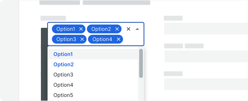
Dropdowns conserve screen space by collapsing option lists normally. You can use this compact design when dealing with a long list. They also permit multi-select like checkboxes.
Normally, each selection will be displayed as a chip in the dropdown section.
What to take note of when designing dropdown lists with multi-selection?
Selecting multiple items requires more physical and cognitive effort compared to checkboxes due to the extra steps of expanding/closing the list.
Additionally, dropdowns don’t provide an overview of all available choices simultaneously in the way checkboxes display full option lists. Users may overlook less prominent options buried in an expanded dropdown. This could potentially slow decision-making processes for some tasks.
Checkboxes, on the other hand, allow scanning all visible options at once and selecting multiple items with simple taps. Selected choices are also immediately apparent visually. While checkboxes use more screen real estate, this tradeoff may be worthwhile considering the ease and speed of use advantages.
And again, dropdown lists with multi-selection can appear unusual to some users. Also, it can be hard to use on smaller devices. So when you are designing for mobile, it’s best to avoid this option.
Consider progressive disclosure for a long checkbox list

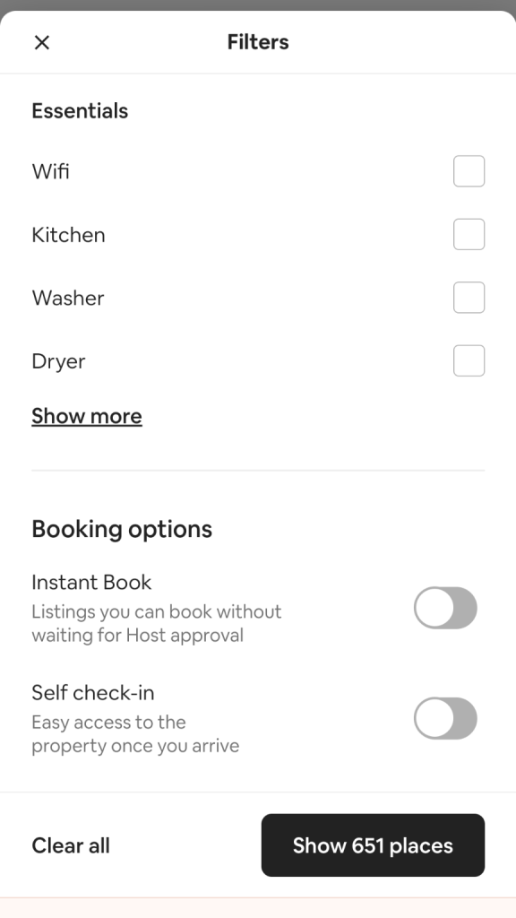
I’ve found plain old checkboxes work great…until you start amassing a ton of choices. We’ve all been there – faced with a daunting checklist containing dozens of options and wondering how to fit them all onto one page possibly. Then they start getting messy. Dropdowns save space but aren’t as scannable.
You can start with the top 5-7 most common options in this situation. Then add a simple “Show More” button to reveal additional selections.
By doing so, you can limit the users’ choices, and prevent them from being too overwhelmed while still letting them access more options.
Decision graph
Conclusion
In conclusion, checkboxes remain a very effective form of control for allowing multiple selections in most scenarios due to their simplicity and intuitiveness. However, in some cases where space is limited or a more customized visual design would be beneficial, alternatives like check tokens or dropdowns may offer advantages worth exploring.
Key considerations for non-standard controls include ensuring users clearly understand the multi-select capability without relying solely on learned checkbox behaviors. Additional design cues may be needed for unfamiliar interactions. It’s also important to evaluate if alternatives genuinely improve the experience or just introduce unnecessary complexity compared to checkboxes.
Progressive disclosure can help manage long checkbox lists in a user-friendly way, while still making all options accessible.


